Dashboard
Qlarm Dashboards are designed to display the custom Dashboards along with various configured Widget. It is highly flexible and enables you to create your own Dashboards and share between other Dashboard viewers. Qlarm comes with a variety of configurable Widgets that you can use to build a specific Dashboard view that meets the different needs of your business. They provide you real-time monitoring of sensor values with configurable states which makes the detection of desired on undesired behaviors much more easier.
Overview
The Dashboard View contains two main components, configuration header and display grid. The configuration header contains essential functionalities for Dashboard configuration which can be accessed by clicking the  button. The display grid displays the available Dashboards that can be selected from the Dashboards list, and there you can configure the presentation and layout of the Widgets within the selected Dashboard.
Working with Dashboards
In the following sections, the two main functionalities of Qlarm Dashboards are explained:
- Viewing Dashboards
- Managing Dashboards
Viewing Dashboards
Default Dashboard
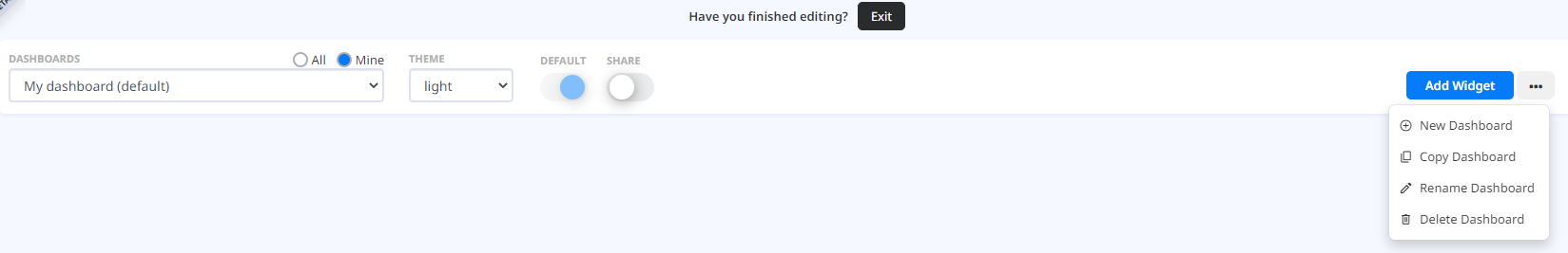
Upon logging into Qlarm a Default Dashboard is displayed. The Default Dashboard at first login is the “System Dashboard”, but any other Dashboard that is available can be selected to be the new Default Dashboard by switching the “Default” toggle button  .
.
Dashboard list
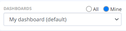
The “Dashboards” dropdown list allows you to select the Dashboard you want to view. All the available Dashboards are listed here, including the default “System Dashboard” and other Dashboards that are shared by other Users. You can always filter the list to view your dashboards or all the other dashboards that are shared with you.
Dashboard themes
The “Theme” dropdown list is used to select and change the visual colour of the Dashboard you are choosing to configure. By default, the light theme is selected, other themes, include the blue, dark and extra dark theme.
Sharing a Dashboard
By checking the “Share” checkbox  , you can enable a selected Dashboard that you configured and share it with the other Users.
Managing Dashboards
Configure header
The configuration header contains the main functionalities that allow you to configure Dashboards to your needs. In view mode, you can view different Dashboards that are available, and you can change them from the “Dashboards” dropdown list. You can enter edit mode by clicking the button.

In edit mode the configuration header is changed by adding new functionalities so you can configure Dashboards.
Dashboard configuration
The right cluster of buttons contains the main functionalities for configuring the Dashboard you are working on.
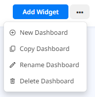
New Dashboard and Add Widgets
The “New Dashboard” button 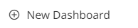 allows you to create a new Dashboard. When you go to New Dashboard, a new window opens to configure your new Dashboard. You can select a name for it under the “Dashboard Name” field and add custom Widgets.
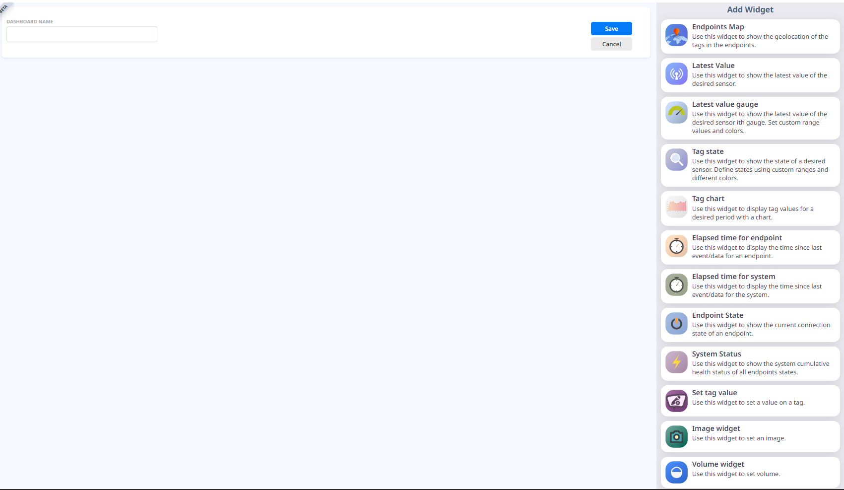
When you select a Widget from the list, it is shown on the grid panel. To organize the widgets in the grip panel you can drag and drop them to the desired location and order. To resize a Widget, use the Widget handle  located in the lower right corner on every Widget or by drag and drop edges and corners. After configuring the Dashboard layout you can click the
  button to save the Dashboard or the
  button if you do not want to save the Dashboard. Afterwards, if you need to add additional Widgets to the Dashboard, you only need to click the
  button by which you are greeted with the same window as if you were creating a new Dashboard.
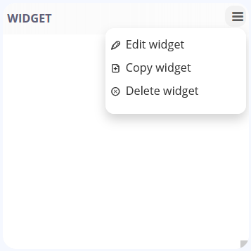
All Widgets can be configured by clicking the configure button visible for any un-configured widget on the dashboard or by opening the Widget Menu and selecting “Edit Widget”. An edit widget form opens for you to configure it. Every Widget has its own unique configuration parameter (more on this in the Widgets subsection).
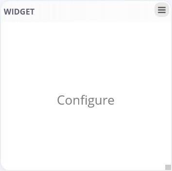
You can save the Widget configuration by clicking the  button, or you can close the edit window by clicking the
  button.
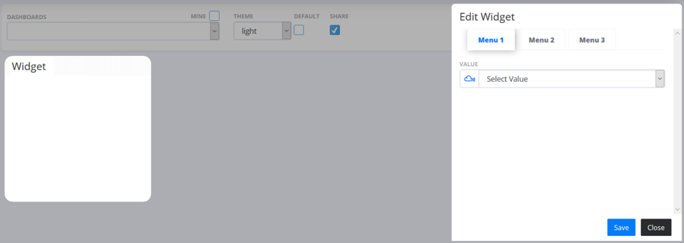
When the Widget configuration is complete, the Widget Menu is updated with the new options defined by the Widget.
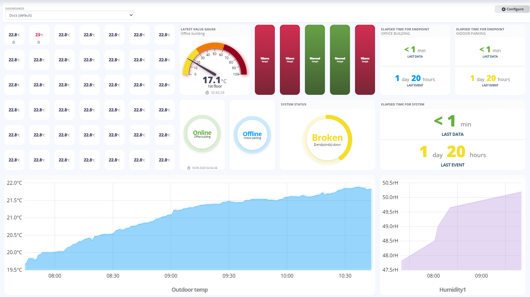
Widgets
The Widget List contains eight different types of Widgets that can be added one by one from the list.
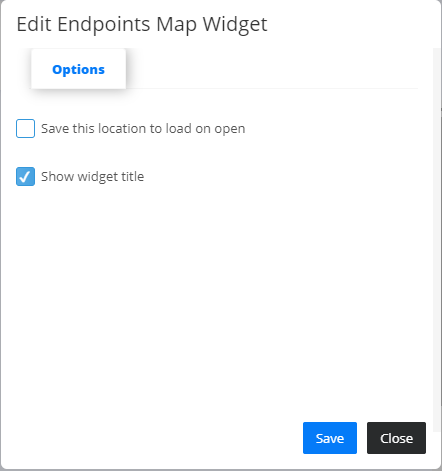
- Endpoints Map Widget
 - shows the precise location of the given endpoints that you have access to. Each endpoint is represented with a pin, which changes color depending of the availability status of the endpoint, “Offline” state is colored in red meaning the endpoint is unavailable and “Online” state colored in green meaning the endpoint is up and running. Navigation through the widget is simple by dragging the with the cursor and zooming in and out using the mouse scroll. When hovering over a specific endpoint pin, an information bubble appears that contains basic information about the endpoint: Name, Description, Status and Location. when editing the Endpoints Map widget, by checking the first checkbox you can set the precise zoom level and location upon which you want to view when logging in to Qlarm or navigating to dashboard view.
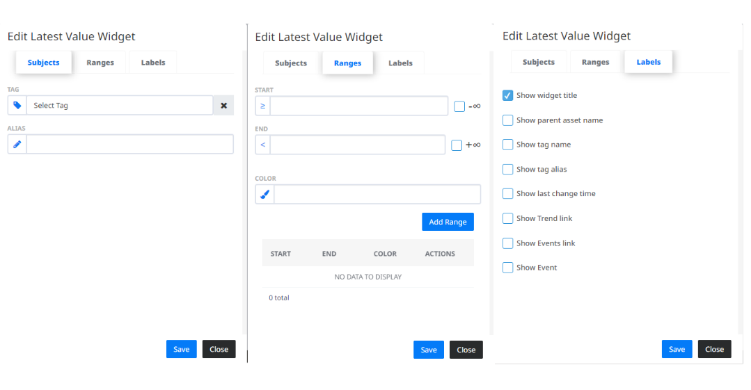
- Latest Value Widget
 - shows the latest value of a selected sensor. In the “Subjects” tab you can select a Tag for which you want to see the latest value. You can also give the Widget an alias name to differ from the other Latest Value Widgets. In the “Ranges” tab you can adjust custom ranges to view the latest value in a certain colour, if it falls in that range. The “Labels” tab contains additional settings for Widget configuration.
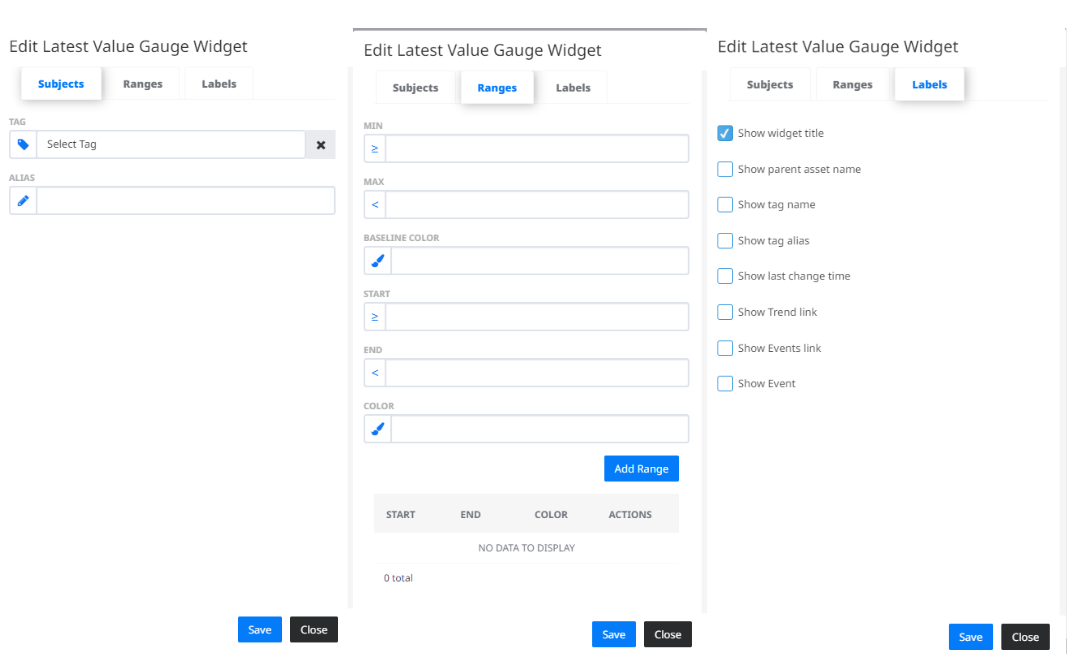
- Latest Value Gauge
 - shows the latest value of a selected sensor using a gauge with custom range values and colours. In the “Subjects” tab you can select a Tag for which you want to see the latest value. You can also give the Widget an alias name to differ from the other Latest Value Gauge Widgets. In the “Ranges” tab you can adjust the appearance of the gauge. First you need to set the minimum and maximum value and the base colour of the scale. Then you can add custom ranges on the scale to view the latest value in a certain colour, if it falls in that range. The “Labels” tab contains additional settings for Widget configuration.
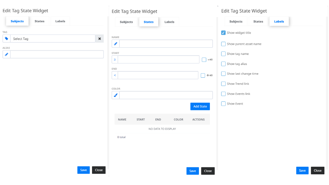
- Tag State
 - shows the state of a selected sensor by setting custom range values and different colours. In the “Subjects” tab you can select a Tag for which you want to see the Tag State. You can also give the Widget an alias name to differ from the other Latest Value Widgets. In the “States” tab you can adjust custom ranges to view the Tag State in a certain colour, if it falls in that range. The “Labels” tab contains additional settings for Widget configuration.
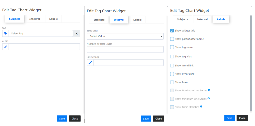
- Tag Chart
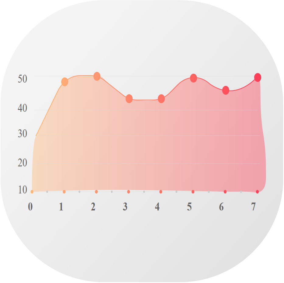 - displays the values of the selected Tag for a specified time period. The values in this widget are downsampled, grouped in short intervals, to optimize the performance of the application. This widget supports live tracking for time periods shorter than a day and statistical analysis for periods longer than a day, which can be set in the edit menu. When editing the widget, in the “Subjects” tab you can select a Tag for which you want to see the Tag Chart. You can also give the Widget an alias name to differ from the other Latest Value Widgets. In the “Interval” tab you can adjust the time unit type, number of time units and the display color. When selecting the time unit type, if you select “Hour” and enter a number of time units less or equal to 24, this sets the live tracking mode for the tag chart widget, which means the graph will be updated whenever the Tag records new values. When selecting other time units: “Day”, “Week” and “Month”; we can enable Max interval, Min interval and Basic Statistics which can be set in the “Labels” tab. The Max and Min interval are an addition to the main interval line, which represent the highest and lowest value in the grouped interval. The Basic statistics label calculates the: “Average”, “Maximum”, “Minimum” and “Standard Deviation”; for the specified time period. Also, whenever you interact with the widget, by zooming in our out the graph, the basic statistic label gets updated for the selected time period.
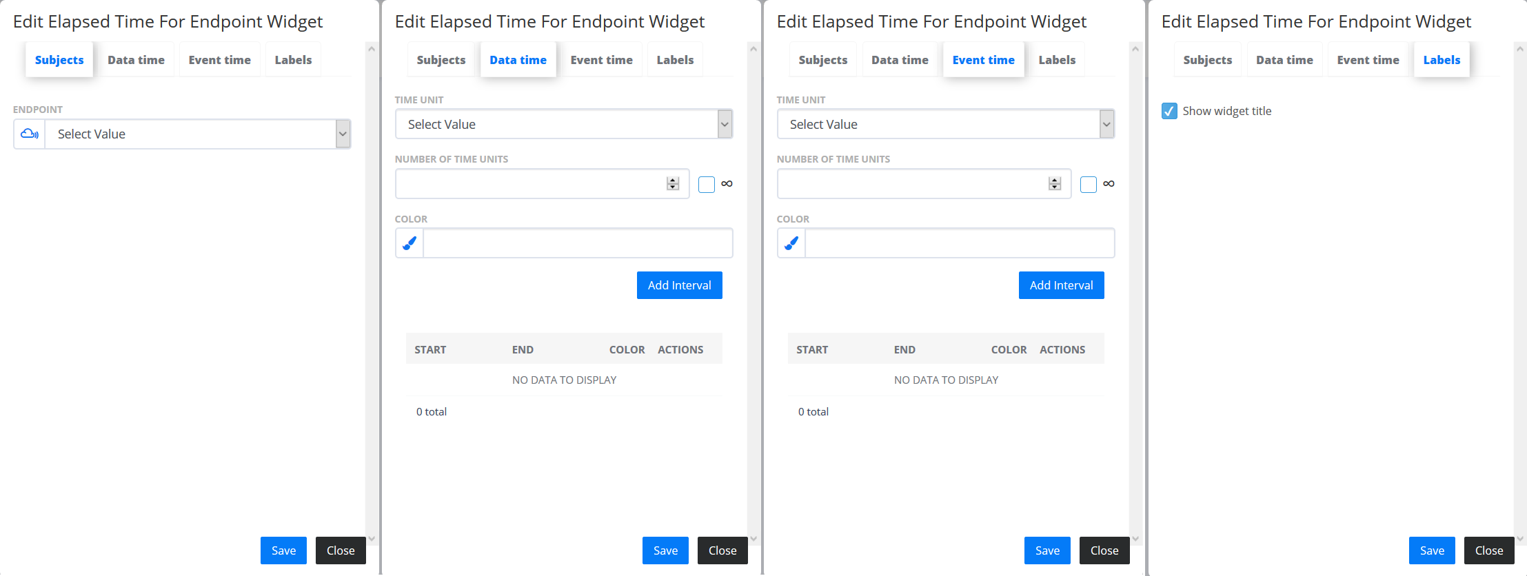
- Elapsed time for Endpoint
 - displays latest log Events from the Endpoint. In the “Subjects” tab you can select an Endpoint to see the elapsed time. In the “Data” and “Event” tabs you can add intervals with different ranges and colours that represent the “Last Data” and “Last Event”. The “Labels” tab contains additional settings for Widget configuration.
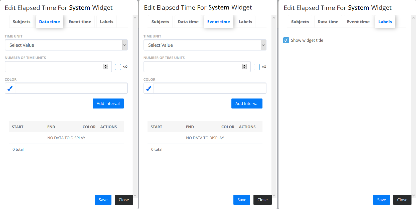
- Elapsed time for system
 - displays latest log Events in the system. Go to “Subjects” tab and select an Endpoint to see the elapsed time. In the “Data” and “Event” tabs you can add intervals with different ranges and colours to represent the “Last Data” and “Last Event”. The “Labels” tab contains additional settings for Widget configuration.
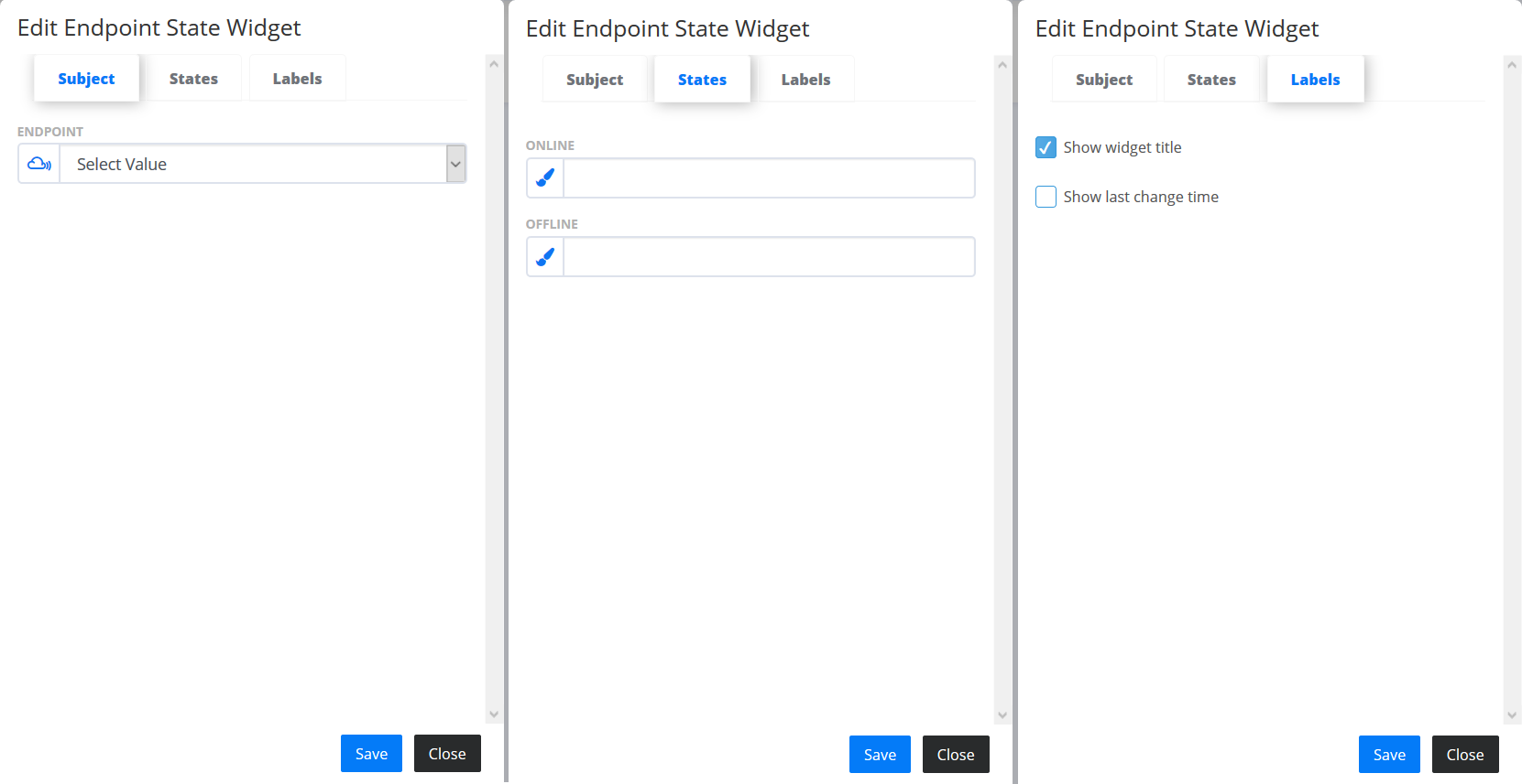
- Endpoint state
 - shows the current connection state of an Endpoint. In the “Subject” tab you can select an Endpoint to monitor its state. In the “States” tab you can add colours for the “ONLINE” and “OFFLINE” status. The “Labels” tab contains additional settings for configuring the Widget.
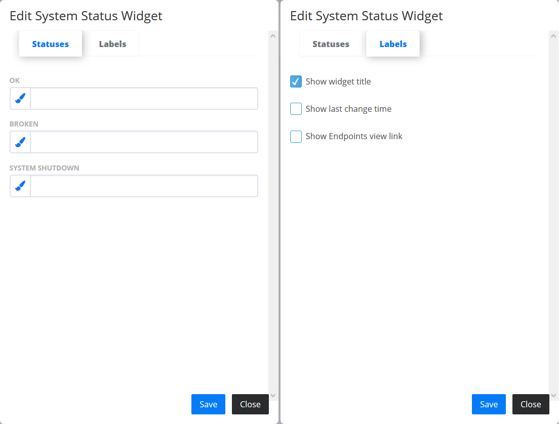
- System status
 - shows the system cumulative health status for all endpoints states. Go to “Statuses” tab to add colours for the “OK”, “BROKEN” and “SYSTEM SHUTDOWN” status. The “Labels” tab contains additional settings for Widget configuration.
- Set tag value
 - represents a widget which can be used for manually setting values to a selected Tag. In the “Subjects” tab you can select a Tag for which you want to set a value manually. In the ‘Select tag’ dropdown are listed only those tags that are writable (read/write). You can also give the Widget an alias name to differ from the other Set Tag Value widgets. The “Labels” tab contains additional settings for Widget configuration.
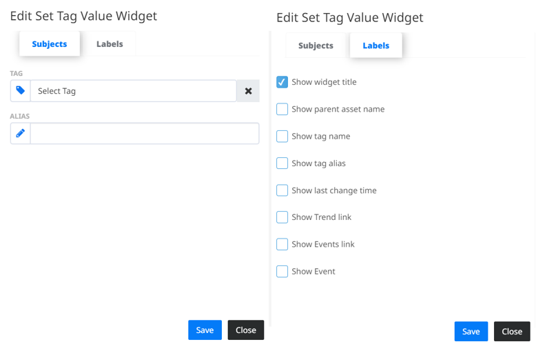
There are two representations of the widget, according to the value type of the chosen Tag. For Boolean Value type tags, there is a toggle button where you can switch the state of the tag (example: On/Off). In this case, the displayed label is set according to the values from ‘State true’ and ‘State false’ configurations from Endpoints->Tags section. For Integer, Float and String Value type Tags in the widget we have input field where we can write the value, in the format of XX for Integer, XX.XX for Float and String Value respectively, and by clicking the Set button  we are setting the value manually.
- Image widget
 - represents a widget where users can upload images (jpg and png).
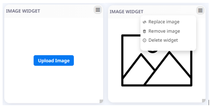
In order to upload an image user should click on the Upload image button (Fig 20. - left image). In order to Replace or Remove the image user can choose from the configuration dropdown menu Replace image or Remove image options (Fig 20. - right image). In order to Delete the widget user can choose the Delete widget option from the configuration dropdown menu.
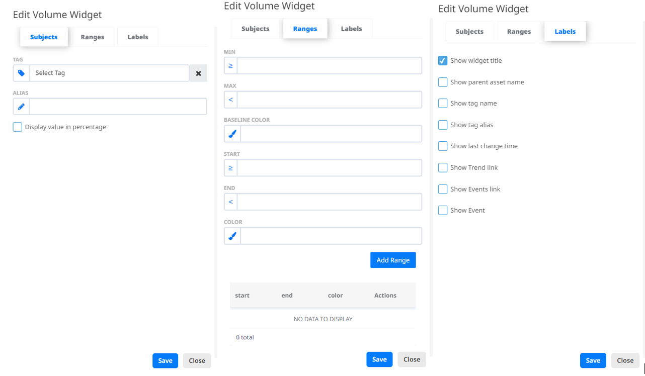
- Volume widget
 - this widget represents the current volume state of a selected Tag. In the “Subjects” tab the user can add an Alias to differ the widget from other widgets. Also, there is an option to see the value in percentages by checking the checkbox “Display value in percentage”.
In the “Ranges” tab you can adjust the appearance of the widget. First you need to set the minimum and maximum value and the base colour of the widget. Then you can add custom ranges on the scale to view the value in a certain colour, if it falls in that range.
The “Labels” tab contains additional settings for the widget configuration.
The user can edit, copy or delete the widget from the configuration dropdown menu.
- this widget represents the current volume state of a selected Tag. In the “Subjects” tab the user can add an Alias to differ the widget from other widgets. Also, there is an option to see the value in percentages by checking the checkbox “Display value in percentage”.
In the “Ranges” tab you can adjust the appearance of the widget. First you need to set the minimum and maximum value and the base colour of the widget. Then you can add custom ranges on the scale to view the value in a certain colour, if it falls in that range.
The “Labels” tab contains additional settings for the widget configuration.
The user can edit, copy or delete the widget from the configuration dropdown menu.
Save Dashboard
To keep the changes in the Dashboard you can save the configurations by clicking on the  button.
When configuring existing dashboard changes are saved automatically.
button.
When configuring existing dashboard changes are saved automatically.
Delete Dashboard
The  button deletes the selected Dashboard that you have configured.
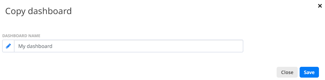
Copy Dashboard
Whenever you are viewing a Dashboard created by another User, you can copy the existing Dashboard by clicking on the  button. This will ask you if you want to rename the Dashboard and save the copy as your own after clicking the
  button.
Exit Dashboard
The  button allows us to leave the edit mode and get back to the view mode.