Trend
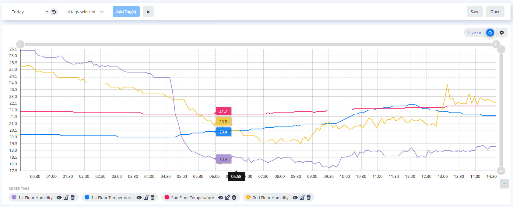
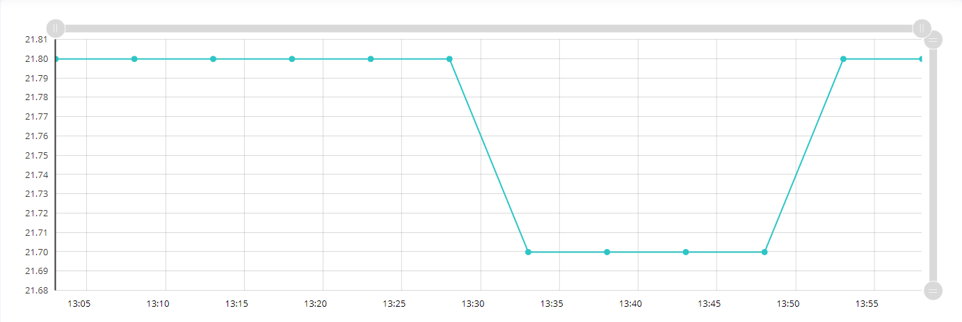
The Trend page provides a flexible chart for visualizing your data. Data from multiple Tags can be displayed on the chart, and the time period from which the data are collected can be adjusted. The resulting trend view can be saved as a Report which can be retrieved later or saved to file.
Getting started
The trend window is by default blank when entering the Trend page. In order to start viewing your data, you can either add individual tags or load a previously saved Report.
Adding tags to the chart
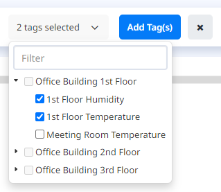
Multiple Tags can be added to the chart in order to view their data. This is done by selecting one or more Tags (max 5) from the multiselect “TAGS” tree view dropdown list.
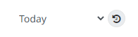
Change time period
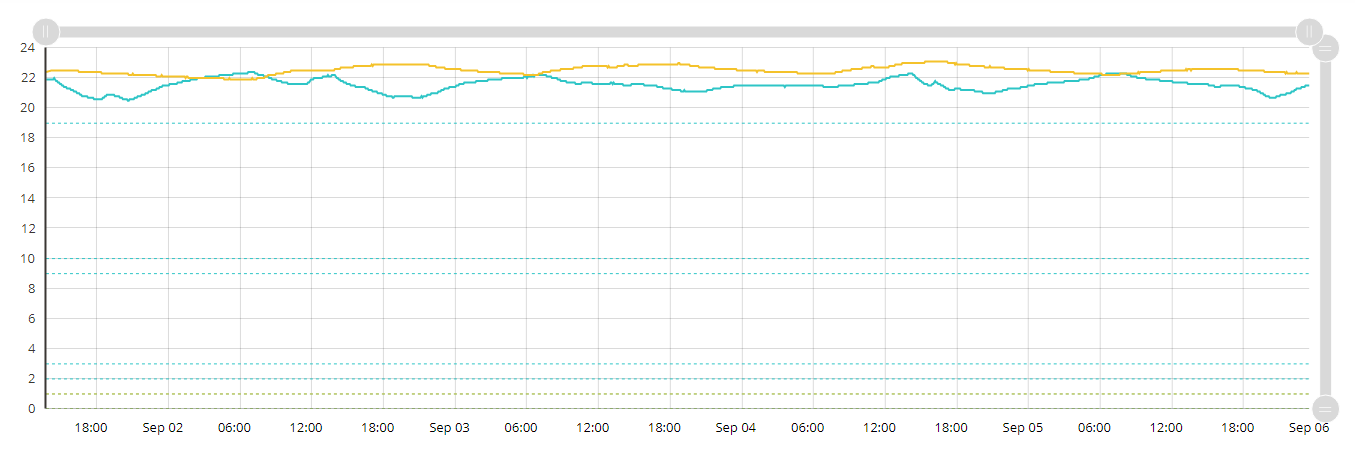
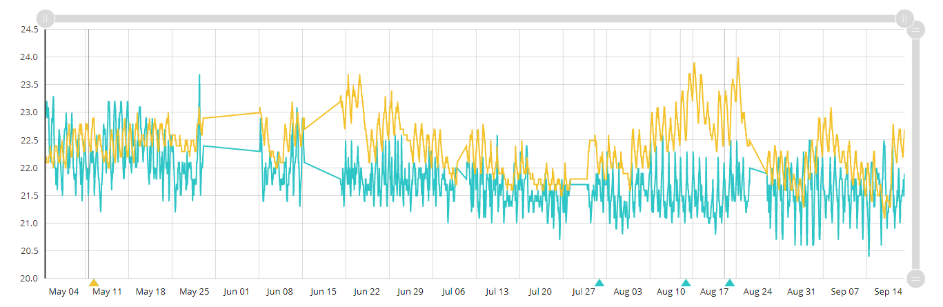
Tag data can be displayed in the chart for the selected period. You can choose the period from the dropdown “TIME” list for specified periods or choose a “Custom” period (“Today” is the initial preselected period).
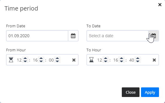
When you choose a Custom time period, or click  , a popup is shown for start and end date and time to be selected. Click “Apply” to apply the time settings in the chart.
Customize the chart
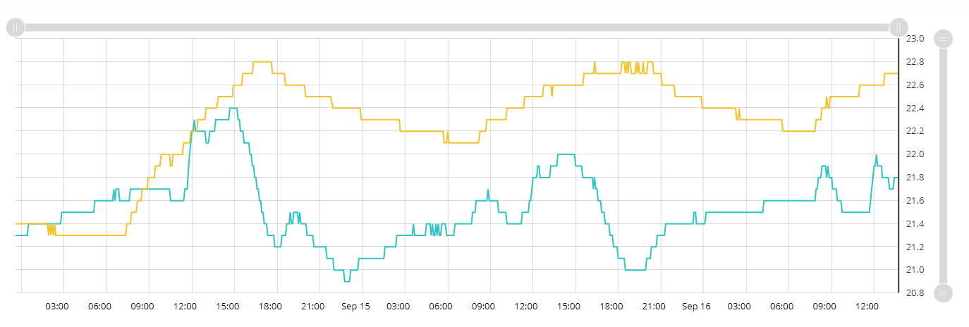
Chart displays can be customized in “Configuration” tab. Click  to set parameters for various chart displays.
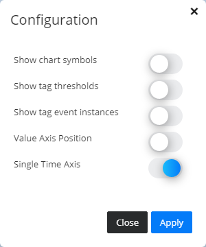
If “Show chart symbols” is applied:
If “Show chart thresholds” is applied:
If “Show events” is applied:
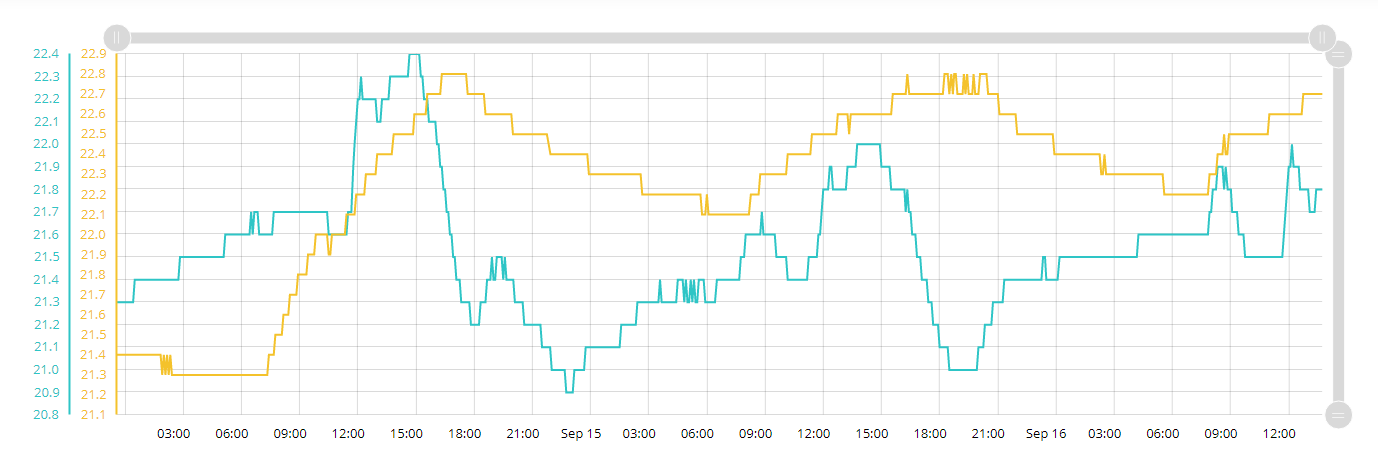
If “Value Axis Position” is applied:
If “Single Time Axis” is not applied (value axis by Tag displayed):
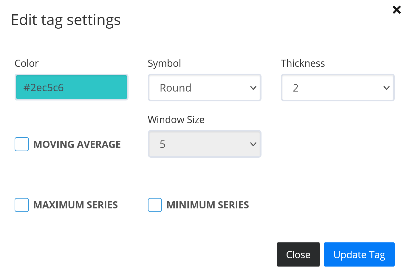
Configure trend line
Each trend line’s “Color”, “Thickness” and “Symbol” is customizable via configuration in the “Edit tag settings”.
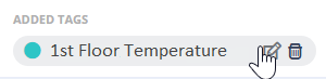
Delete tags
Delete individual Tags from the chart by clicking the delete button in the chart tag.

Reset chart
Clear the chart of all tags and trends by clicking the reset button  .
.
Reports
Reports are collections of Tags which can be saved with their associated time period for later retrieval.
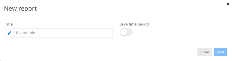
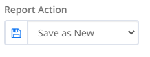
Save Report
The Save button stores all the currently selected Tags in a Report.  .
.
Choose a unique name for your Report, and enable “Save Time Period” to save your choice of Time Period other than “Last Day”.
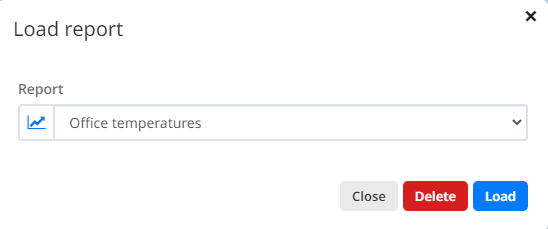
Load Report
Saved Reports can be loaded by clicking the “Open” button  . The “Load Report” popup lets you select the Report you want to load from a list of saved reports. Click “Load” to retrieve the selected Report. Click “Delete” to delete chosen report.
Edit Report
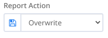
If you edit a loaded Report and if you want to save it, you will get access to the “Overwrite” option in the popup from Fig 14. This overwrites the currently selected Report.
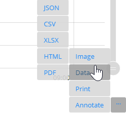
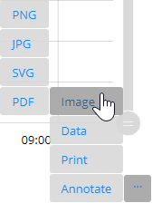
Export chart data
Chart data can be exported as JSON, CSV, XLSX, HTML, PDF.